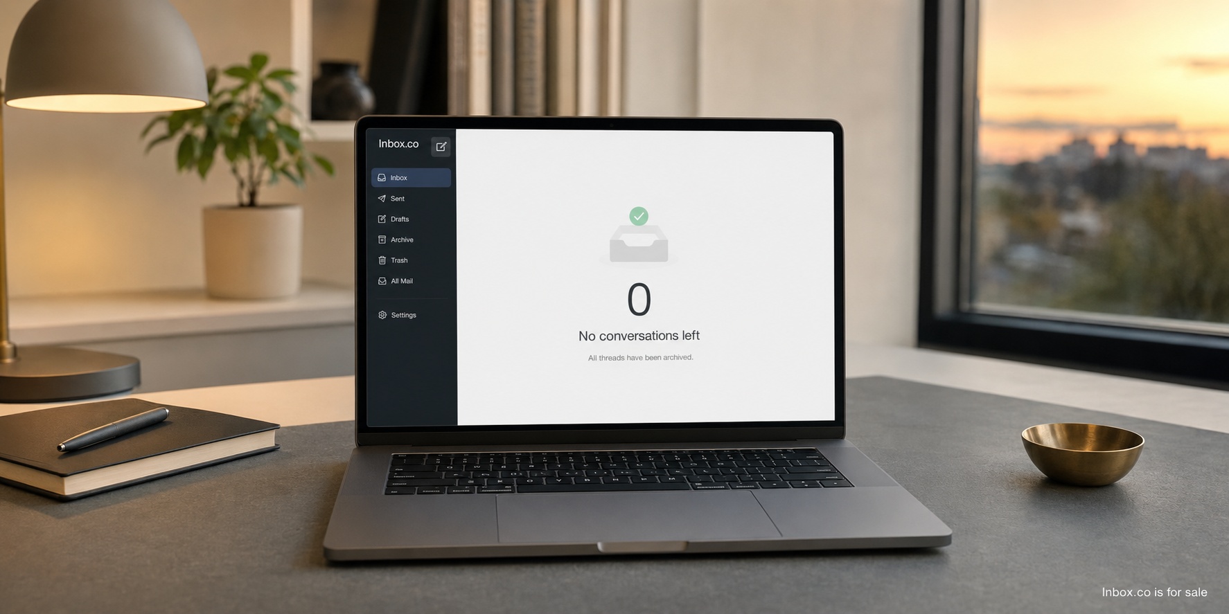
An inbox-zero app should help a person make clear decisions about incoming mail and then get out of the way. It should not turn an empty inbox into a moral achievement, a public streak, or a reason to touch every message several times. Zero is a temporary state in a system designed to receive more.
The useful idea behind inbox zero is that an inbox should not double as a vague list of unresolved obligations. The distinction between commitments and lists is central to Getting Things Done. A message can be answered, scheduled, converted into a real task, retained as reference, archived, deleted, or reported as unwanted.
Know when zero becomes a harmful score
Zero becomes harmful when the number replaces the purpose of processing mail. A person may archive something merely to clear a badge, answer before thinking, or repeatedly sweep messages into a “later” folder that is just a second inbox. The interface looks successful while the commitments remain. Streaks, celebratory animations, and comparisons can make that behavior worse by attaching identity to a state that new mail will inevitably interrupt.
An app should treat zero as one possible by-product of clear decisions, not the universal finish line. Some people responsibly keep several active threads visible. Others process once a day and reach zero briefly. During illness, travel, caregiving, or a demanding project, a larger queue may be the rational choice. The product should support a changing capacity rather than imply that every unread message is a personal failure.
Better feedback describes the system rather than judging the person. It can show how many messages lack a decision, whether reminders are overdue, or which important contacts have waited unusually long. It can also make a quiet suggestion to pause when processing becomes a repetitive clearing exercise. A useful app helps the user recover control; it does not create a new performance metric to maintain.
Separate messages from commitments
Some email requires a reply. Some creates work that belongs on a calendar or task list. Some simply communicates a fact. An effective app lets the user distinguish these cases without building a complicated taxonomy. Reply, remind, keep, and archive can cover most personal workflows.
Put newsletters on a reading path
Newsletters are a common source of confusion because they may be valuable without being commitments. Mixing them with direct questions makes both kinds of mail harder to handle. An inbox-zero app should let users collect chosen publications into a reading view, deliver them at a preferred time, and keep the original sender and unsubscribe controls visible. It should never assume that every bulk message is unwanted or that every subscription deserves immediate attention.
The distinction should follow intent, not just sender technology. A school bulletin or neighborhood alert may be distributed in bulk but contain a date a family cannot miss. A personal note from a salesperson may look direct while requiring no response. The app can propose a category from past behavior and message signals, but the user needs an easy correction that improves future grouping. Important exceptions should be visible without forcing all newsletters back into the primary queue.
Define what “done” means
A message is done when the user has completed or deliberately declined the commitment it represents, not simply when it has been read. For an invitation, done might mean responding and adding the event to a calendar. For a bill, it might mean confirming payment. For a question delegated to a colleague, it may mean recording who owns the next step and when to follow up. The app should make these outcomes explicit without requiring a project-management form for ordinary mail.
Completion also needs boundaries. If the user sends an answer and is genuinely waiting on someone else, the thread can leave the active queue. If the reply includes a promise to deliver something Friday, sending it is not completion; the promise belongs in a trusted task or calendar system. A compact “waiting” state can help, but it should have a review date so it does not become another permanent pile.
A reminder needs a visible return time and a dependable state. When the message returns, the user should see why it was deferred and whether anything changed in the thread. Repeated deferrals can prompt a private question: is this a real commitment, a task for another system, or something the user can decline?
Distinguish reminders from real tasks
Snoozing is appropriate when the message itself is the thing the user needs to see later: check-in instructions on the morning of a trip, for example, or an agenda shortly before a meeting. It is weaker when the email merely contains work. “Prepare the budget” needs a task with a due date, perhaps subtasks and project context. Hiding the request until the deadline removes it from sight precisely when the user may need to plan it.
A good app can offer a lightweight handoff to a task system such as Todoist for personal commitments or Asana for team work, carrying a stable link to the message rather than copying an entire private thread. It should avoid maintaining two conflicting completion states. Calling every deferred email a task only changes the label on the same ambiguity.
Reference messages should be searchable without remaining active. Receipts, confirmations, and instructions often matter later but do not deserve daily attention. Good extraction can identify dates and totals, but the original message remains the source of truth.
Make processing efficient without making it frantic
Keyboard shortcuts, bulk selection, sender grouping, and predictable focus order can speed routine decisions. The interface should also work fully with touch, pointer, and assistive technology. Speed is useful only when the user understands what an action will do and can undo a mistake.
Bulk actions need a preview. An app might group newsletters or automated receipts, but it should show the included senders and messages before archiving or deleting. Rules written in natural language should compile into visible conditions that users can inspect and edit.
Unsubscribe tools should surface standard mechanisms and identify the sender involved. They should warn when a link appears suspicious and avoid claiming success until the request is confirmed. Blocking and filtering should be reversible. The Federal Trade Commission’s consumer guidance offers practical context for unwanted mail and phishing awareness.
Protect attention by default
Every sender should not have an equal right to interrupt. The American Psychological Association’s attention resources and Cal Newport’s work offer useful context for protecting focus. An inbox-zero app can offer quiet defaults, scheduled delivery for lower-priority categories, and immediate alerts for security notices or chosen people.
The application should avoid badges that imply catastrophe. A count can be informative, but color, animation, and persistent alerts often manufacture urgency. A daily review window may be more helpful than continuous arrival. The product should measure whether it helps users reduce checking, not maximize daily opens.
Make notification hygiene understandable
Notification settings should describe outcomes in plain language. “Alert me when these people write” is clearer than a grid of provider-specific priority labels. Users need separate controls for sound, lock-screen previews, badges, and digest delivery because each creates a different kind of interruption or privacy risk. A preview that is convenient at home may expose sensitive text on a shared office screen.
The app should also help users audit interruptions after the novelty period. A weekly view might show which alerts led to prompt, useful action and which merely caused another inbox check. That information should remain private and serve the user, not become an engagement score. Security warnings and time-sensitive messages can bypass quiet delivery, but the rule and its source need to be visible so ordinary marketing cannot quietly claim the same urgency.
I care about this distinction because I have worked from home for more than twenty years. I am now in my forties, living in northern New Jersey in the New York City suburbs, with a preschool-age son. Work and family do not remain in perfectly separate rectangles. Software that creates another ambient alarm consumes attention even when no window is open.
Use AI for assistance, not authority
AI can summarize a long thread, propose a category, extract a requested date, or help tighten a draft. Each feature should make its source and uncertainty available. A summary is a navigation aid, not evidence. A proposed reply remains a draft until the person checks names, dates, commitments, tone, and recipients.
Automatic sending is a poor default for personal mail. A model does not own the relationship or live with the promise it makes. High-risk messages involving money, health, account security, employment, or legal matters deserve extra friction rather than less.
Users should know which model processes content, why the content is sent, how long it is retained, and whether it is used for training. The product’s policy should meet the clarity users can examine in Mozilla’s privacy materials. Private correspondence should not quietly subsidize an advertising or model-training business.
Search and portability are core features
A calm inbox becomes stressful the moment a user cannot find an archived message. Search should support senders, recipients, dates, phrases, attachments, and exact terms. Results need useful excerpts and a stable chronological option. Saved searches can handle recurring needs without forcing users into folders.
Make archive trustworthy through retrieval
Archive only works as a confident decision when retrieval is dependable. Search should tolerate remembered fragments while still offering exact matching for order numbers, addresses, and quoted phrases. Filters need to combine naturally: a PDF from a particular sender last winter, or a message to two recipients containing a specific word. Results should explain why they matched instead of burying the term inside an unexplained relevance ranking.
Attachments deserve first-class treatment. Users often remember the document but not the subject line that carried it. File type, filename, sender, and date filters can recover that context. Threading must not hide an older attachment or present the newest message as if it contains the whole record. When indexing is incomplete, the app should say so plainly rather than returning an empty screen that suggests the message never existed.
The application should connect to existing providers through supported protocols and authorization methods. It must be clear whether an action changes the source mailbox or only a local view. Users should be able to export messages, contacts, rules, and reminders in documented formats.
Portability changes product behavior for the better. When leaving is possible, the app must keep earning trust through experience. It also reduces the fear of trying a new interface around years of personal history.
How I would evaluate one
I research before I buy, especially when a tool asks for access to email. I read the privacy policy, security documentation, export instructions, independent reviews, and recent release notes. I would compare the workflow with a focused inbox product such as Superhuman. A beautiful demo is not enough.
Then I would connect a lower-risk account or limited history and test for two weeks. I would measure repeated searches, missed important mail, unreliable reminders, notification volume, and time spent processing. I would also note whether I feel compelled to check more often. The emotional cost of an inbox is product data, even if it does not appear on a dashboard.
Use a two-week trial as an operating test
For the first two days, I would avoid elaborate rules. I would connect only the account I intended to test, confirm what permissions were granted, and process mail using the product’s basic actions. This reveals whether the default model makes sense before customization hides its weaknesses. I would deliberately archive a few messages I know I will need, schedule reminders at different intervals, undo bulk actions, and check the same mailbox in its original provider to understand how states synchronize.
During the middle of the trial, I would introduce ordinary pressure: a busy weekday, newsletters, receipts, a long thread, and a message that creates work outside email. I would record failures in simple language. Did an important item disappear into a category? Did a reminder return with enough context? Could I find a confirmation without remembering its exact wording? Did mobile and desktop agree? How often did the app ask me to check it?
In the final days, I would test departure. Export instructions should be understandable, revoking access should be possible through both the app and the mail provider, and messages should remain coherent in the source account. I would review the rules the product created and delete any test data it retained. The decision would rest less on how quickly I reached zero than on whether I trusted the system after normal use and could leave without damage.
Adapt to personal, family, and work contexts
A personal inbox is controlled by one person, but it still spans different roles. Privacy and simplicity may matter more than assignment or analytics. The product should let someone keep medical, financial, and relationship correspondence away from unnecessary processing. It should support a personal rhythm without assuming that response-time statistics are useful or healthy.
A family context introduces shared responsibility without becoming a workplace. Two caregivers may need to see a school request, household bill, travel update, or appointment, while private correspondence remains private. The product needs selective sharing, a clear record of who handled something, and language that feels cooperative rather than managerial. A shared family queue should not require forwarding passwords or exposing an entire personal mailbox.
Work adds formal ownership, retention rules, access changes, and expectations around service. A team may need assignment, internal notes, escalation, audit history, and administrator controls. Those features should not leak into a consumer product simply because they are easy to count, and consumer simplicity should not erase workplace accountability. An app that serves both contexts needs visible boundaries, separate policies, and modes designed around genuinely different relationships.
The key question is not how many accounts the app can connect. It is whether it understands who may see a message, who can make a commitment, what evidence must remain, and what happens when a person leaves a family group or company. Context changes the meaning of “done.” A personal archive, a jointly handled school form, and a customer response may look similar in a list, but they carry different duties.
The best inbox-zero app does not celebrate itself when the queue is empty. It makes each decision understandable, protects the user’s data, returns deferred work reliably, and lets the person close the screen. Zero is not the product. Clarity is.